Design summary
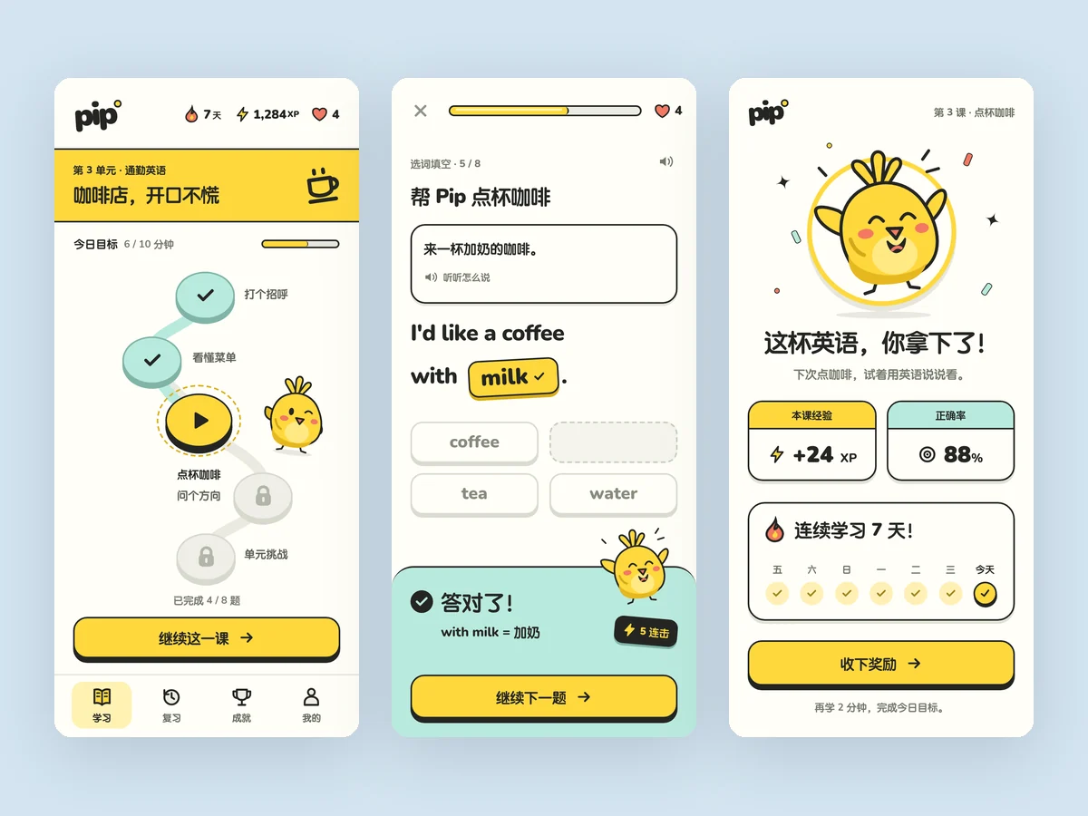
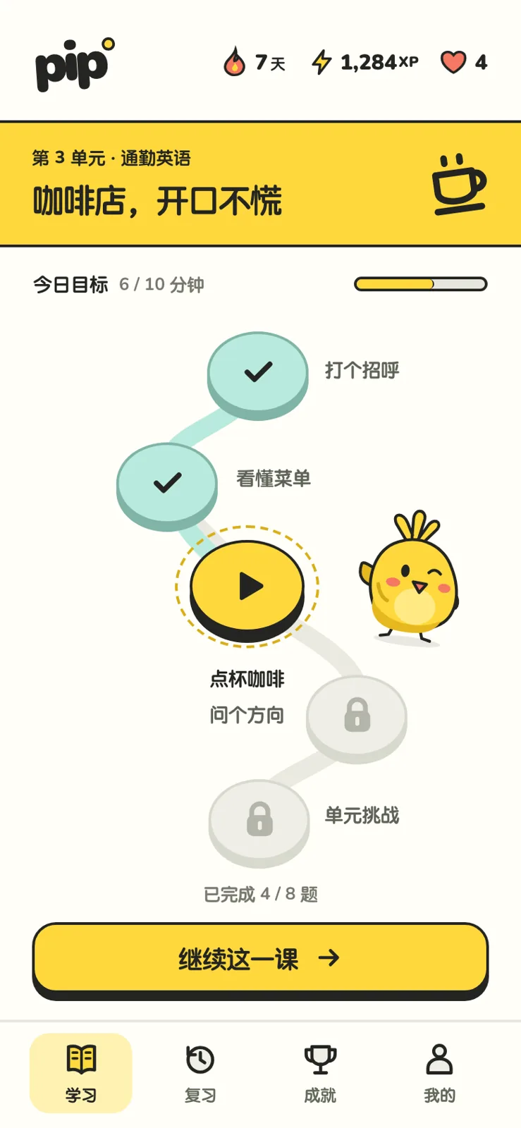
Pip helps working adults practice English through ten-minute daily mini-games, with a winding learning path, answer feedback, and lesson results. A bright-yellow bird, rounded heavy type, and thick black-outlined buttons shape the interface, while mint marks completion and rewards.
Prompt
Product: Pip, an app that teaches English through mini-games for working adults, ten minutes a day. Its mascot is an expressive little bird, drawn in SVG with three to four expressions.
Give it a strong personality like Duolingo: saturated brand colors, chunky dimensional buttons that sink when pressed, rounded heavy type, and exaggerated but clear feedback. Develop your own approach rather than copying Duolingo's green and owl.
Design three key screens:
- Learning path: a winding route of levels with completed, current, and locked levels clearly distinguished. Show a streak, experience points, and lives at the top.
- Question: a word selection fill-in-the-blank or listen-and-choose-an-image question, showing the feedback after a correct answer.
- Lesson complete: a results page with experience points, streak, accuracy, and the mascot celebrating.
Make a correct answer memorable: the button, animations that suggest sound, and the mascot's reaction should make users want another question. This should be apparent in screenshots.
Design the app screens at 390×844. Deliver `index.html` and `screens.html` with the three screens side by side.
View Chinese original
产品:「Pip」,一个用小游戏学英语的 App,面向上班族,每天 10 分钟。有一个吉祥物:一只会做表情的小鸟(用 SVG 画,有 3–4 种表情)。
风格要像多邻国那样有强烈的个性:高饱和的品牌色、厚实有立体感的按钮(按下去会陷下去)、圆润粗壮的字体、夸张但清楚的反馈。但不要照抄多邻国的绿色和猫头鹰,做出自己的一套。
设计 3 个关键屏:
- 学习路径:一条弯曲的关卡路线,已完成、当前、未解锁的关卡一眼能分清,顶部有连续天数、经验值、生命。
- 答题:一道选词填空或听音选图的题,展示答对后的反馈状态。
- 完成一课:结算页,经验值、连续天数、正确率,吉祥物在庆祝。
记忆点:答对那一下,按钮、音效感的动效、吉祥物反应要让人想再来一题。截图里要能看出来。
App 屏幕按 390×844 设计,交付 `index.html` 和把三屏并排的 `screens.html`。