Meridian
Prompt
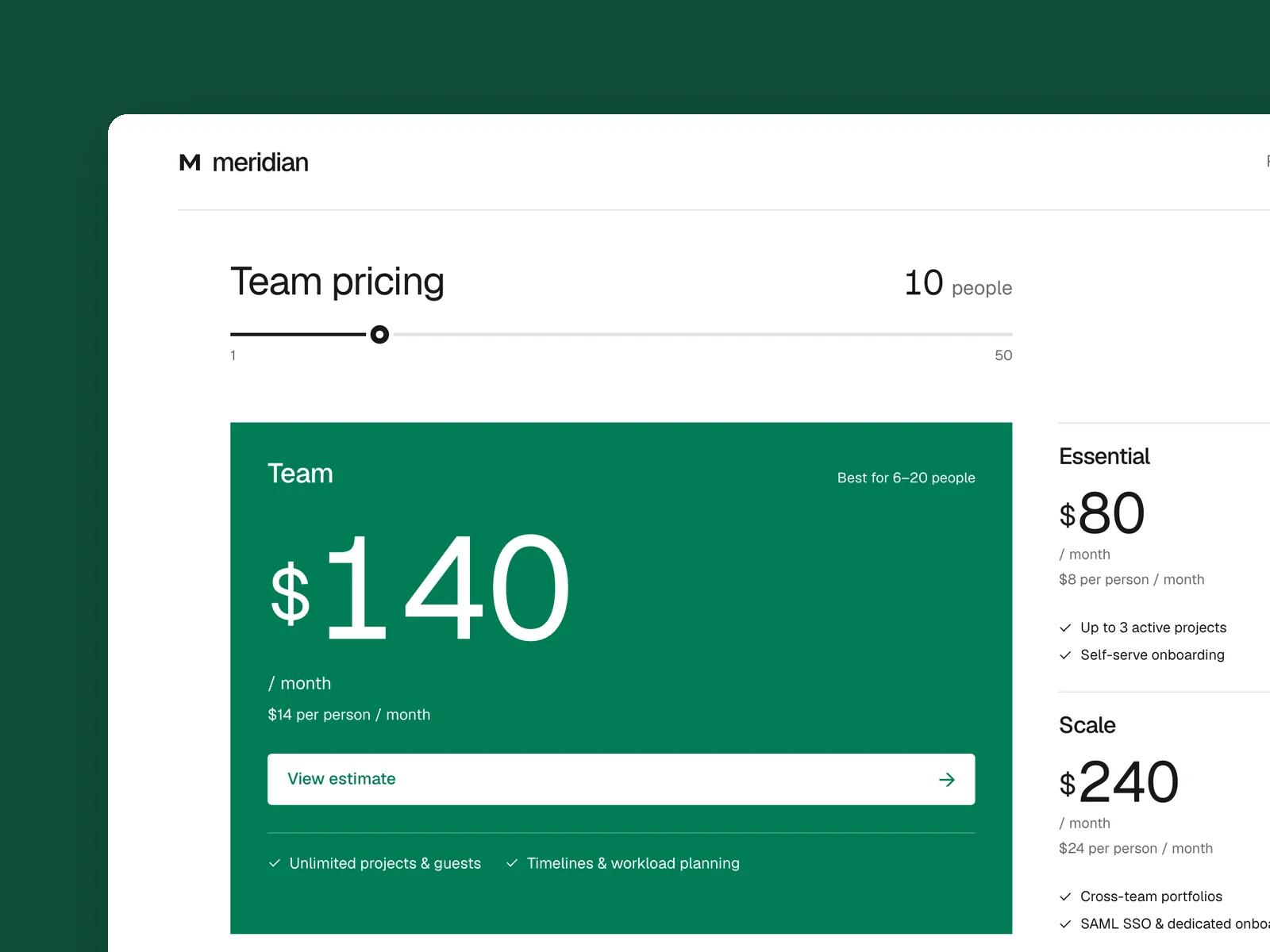
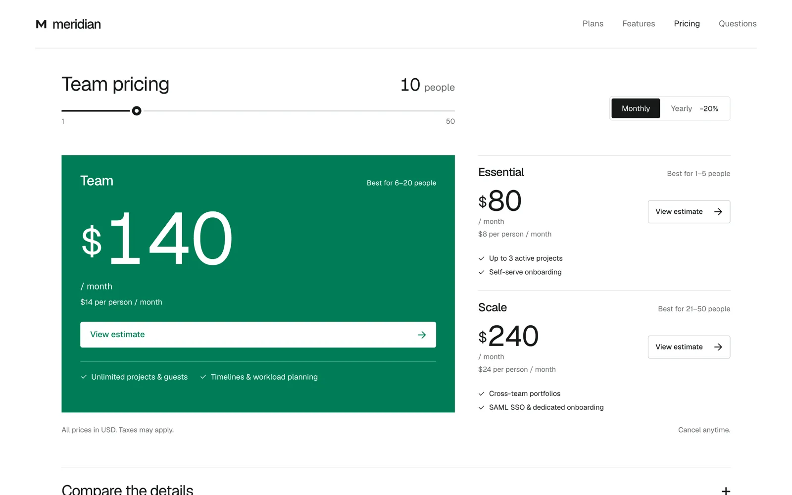
A pricing page for a team collaboration product (starting at 1440×900, responsive down to 390 pixels wide), with an English interface: three tiers, monthly and annual billing, total pricing based on team size, a feature comparison table, and frequently asked questions. The product name and features are fictional.
Prices changing immediately are the core of this work: dragging the team-size control or switching between monthly and annual billing makes each tier’s price roll to its new value, and the recommended tier changes with team size; as the feature comparison table scrolls, the tier names stick to the top. Do not arrange three identical rounded cards in a row.
Colors: a pure-white background, ink-black text, and emerald as the only accent. Do not use warm white, beige, or orange.
Design three states: the default view, annual billing for a 25-person team, and the expanded feature comparison.
View Chinese original
一个团队协作产品的定价页(1440×900 起,响应式到 390 宽),界面用英文:三个档位、月付和年付切换、按团队人数算总价、功能对比表和常见问题。产品名和功能都是虚构的。
价格当场变化是这件作品的核心:拖动人数、切换月付年付时,每档的价格数字滚动到新值,推荐的档位跟着人数变;功能对比表往下滚时档位名吸在顶上。不要做成三张一样的圆角卡片排一排。
配色:纯白底、墨黑字、祖母绿做唯一强调色;不用暖白、米色和橙色。
设计三个状态:默认、年付加 25 人团队、展开功能对比。