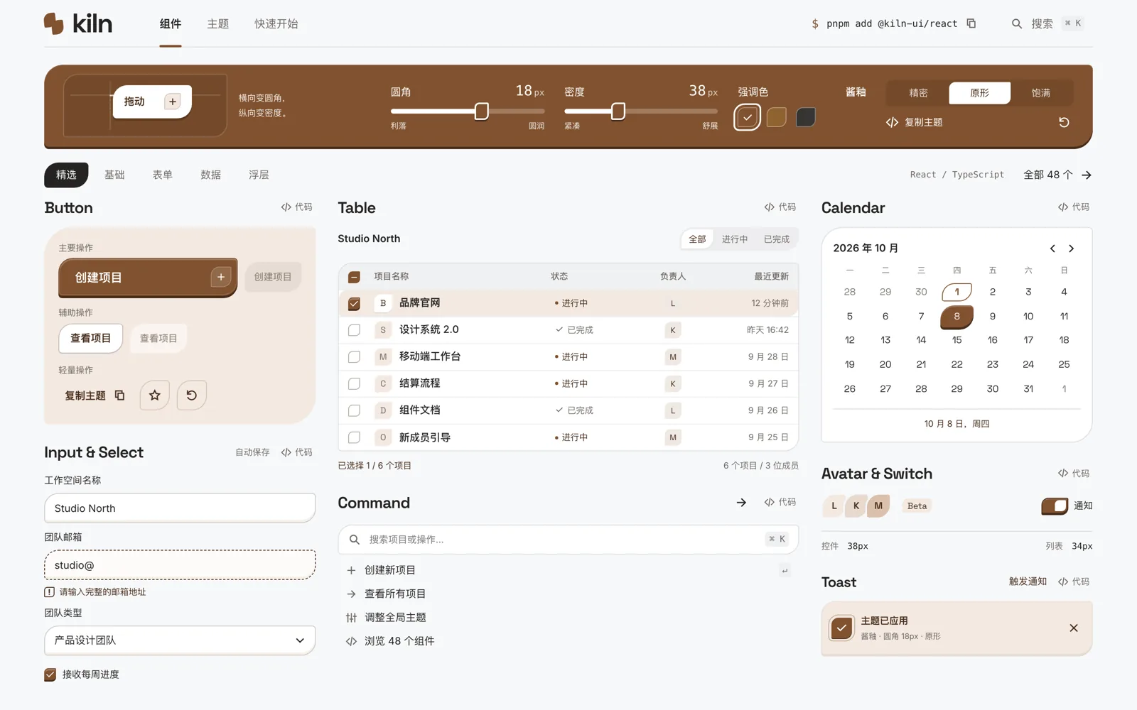
Design summary
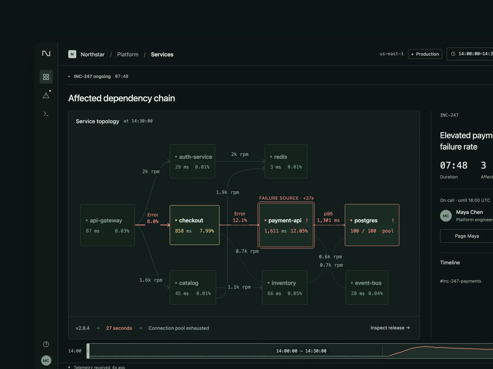
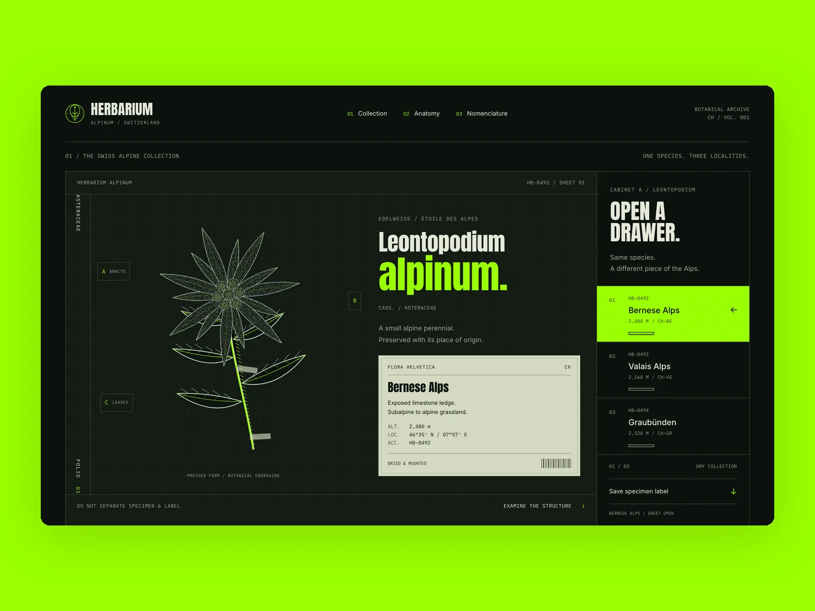
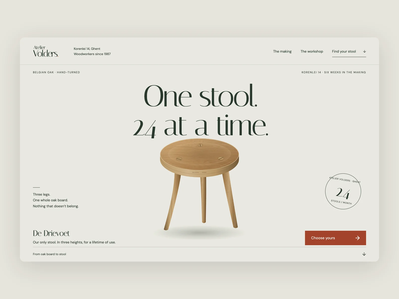
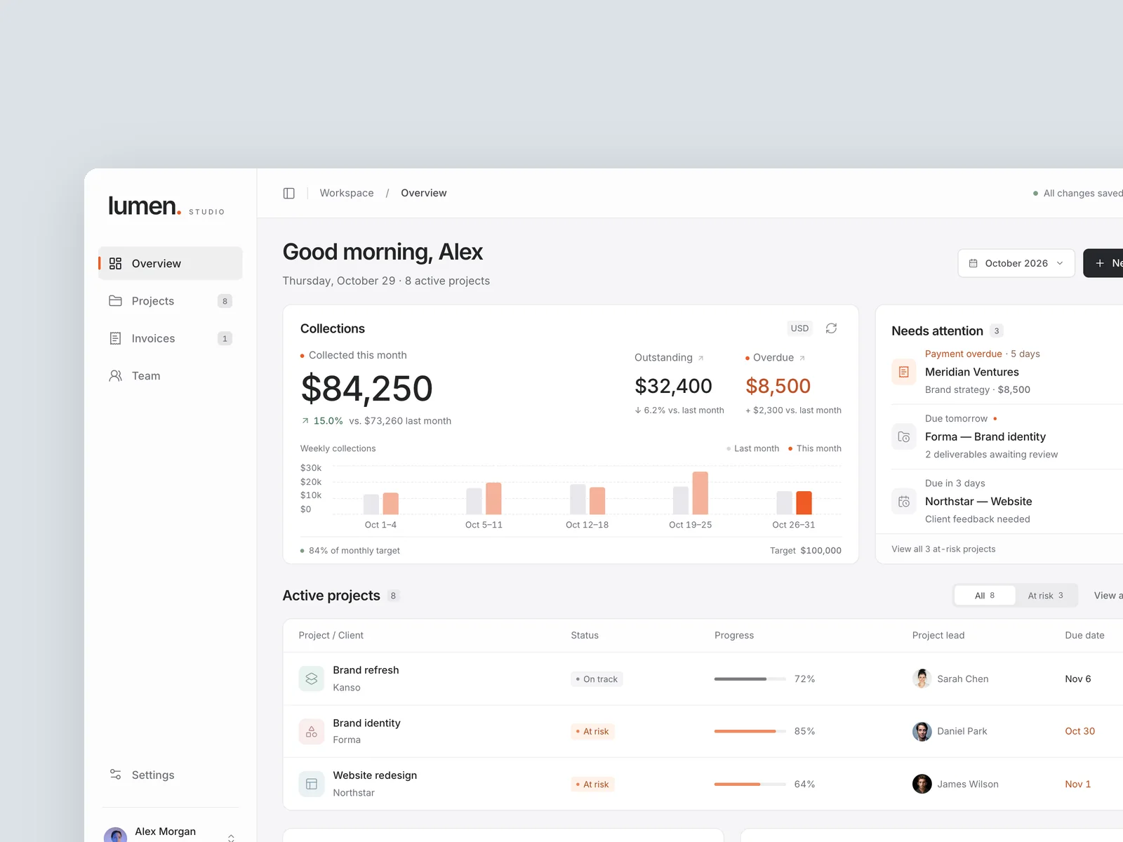
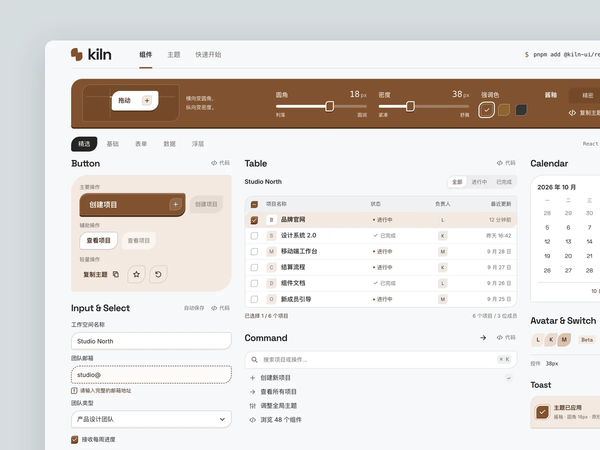
Kiln is an open-source component library website for React developers, presenting more than 40 components—including buttons, inputs, tables, and date pickers—as a working component wall. A cool-white workbench, glazed umber, and impressed end surfaces shape a precise, restrained grid.
Prompt
Product: Kiln, an open-source component library for React developers with more than 40 components, including buttons, inputs, dropdowns, command palettes, dialogs, tooltips, tables, and date pickers. It supports theme customization.
Build its website homepage, optionally with a component detail page:
- Show real interactive components directly on the homepage, rather than screenshots. A “component wall” should contain working components that users can click, type into, and switch.
- Take cues from the precision and restraint of leading developer tool websites: mostly black and white, at most one accent color, a strict grid, and monospace type for code and numbers.
- Make a theme controller memorable: dragging radius, density, or accent color controls changes every component on the page immediately.
- Include a copyable installation command, code snippets, navigation by component category, and realistic usage figures such as GitHub stars and weekly downloads, avoiding overly round numbers.
View Chinese original
产品:「Kiln」,一个给 React 开发者用的开源组件库:按钮、输入框、下拉、命令面板、弹窗、提示、表格、日期选择等 40 多个组件,支持主题定制。
做它的官网首页(可以加一个组件详情页):
- 首页要直接展示真实可交互的组件,而不是截图:一块“组件墙”里放着能点、能输入、能切换的真组件。
- 气质参考一线开发者工具官网的精确与克制:黑白为主,最多一种强调色,严格的网格,等宽字体用在代码和数字上。
- 记忆点:一个主题调节器,拖动圆角、密度或强调色,整页所有组件当场一起变化。
- 要有:安装命令(可复制)、代码片段、组件分类导航、一段真实的使用数据(例如 GitHub 星数、周下载量,数字不整齐)。