
Side-by-Side HTML Style Comparison vs. One-Shot UI Prompting
Asking an AI agent for a single interface draft is like asking a designer for only one sketch—you have no way to judge whether a different typographic scale, spatial rhythm or surface tone would serve the product better. A core habit in Oil UI is generating a side-by-side HTML comparison board with 3 to 4 genuinely distinct directions using your real product copy before building out full application states.
Key takeaways
Good taste requires comparison
viewing 3 distinct directions side by side at 1440px or 390px makes strong hierarchy and weak habits obvious immediately.
Takeaway 2
Real directions differ in spatial composition, typographic voice, surface brightness and focal controls—not just button color swaps.
Takeaway 3
Once you choose a winning direction, commit to its system wholeheartedly instead of splicing incompatible fragments from rejected options.
Takeaway 4
The gallery includes complete multi-direction series built from identical briefs—including nine Orvo pages, three Atelier Volders pages and three Fonderie Mercier pages.
 Oil UIPROQingya Museum · Light & Vessel
Help visitors discover the dates, galleries, and vessels of Light & Vessel, then book a visit.

Light
& Vessel.
Dusk on water
Let dusk fill the frame. Keep the vessels close and the serif title in one quiet corner.
LIGHTJOURNAL

Light on water.
Light on clay.
An exhibition of everyday vessels and natural light.
Morning journal
Open an exhibition journal: a broadsheet grid gathers morning light, vessels, and the details of a visit.
Morning mist.
Quiet light.
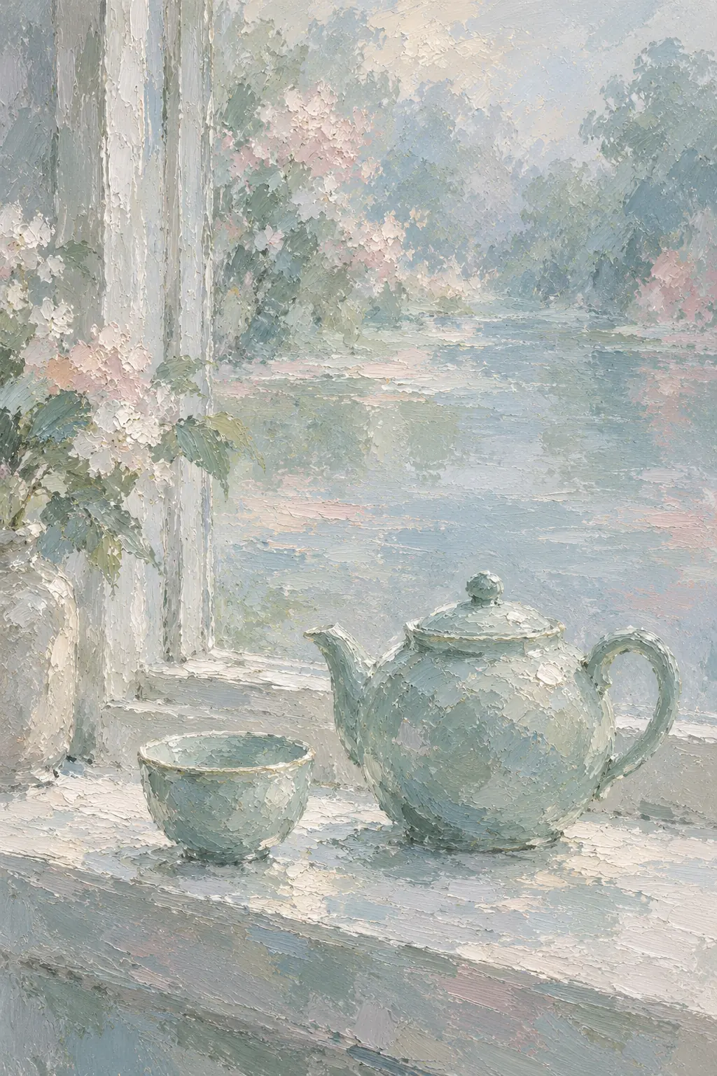
A misted window
Set the painting inside an open window of paper. Celadon and pale water have room to breathe.
Why Single-Draft Prompting Traps You in Local Maxima
When an agent generates only one screen, it naturally picks the safest statistical average. If you reply "make it bolder" or "try dark mode," the agent merely patches the same underlying skeleton, often muddying spacing and contrast along the way.
Generating a side-by-side comparison board first opens up the design space before you invest tokens in secondary states. Every candidate direction uses your actual product name, real pricing tiers and real interactive subject matter rather than placeholder lorem ipsum.
| Product & shared brief | Direction A | Direction B | Direction C & further variations |
|---|---|---|---|
| Orvo (AI website builder; $0 / $24.99 / $34.99 monthly; human expert guidance) | Launch Garden (orvo-garden): bright lime canvas with modular cultivation pacing | Tandem (orvo-tandem): warm editorial paper emphasizing human partnership | Coastal Workshop (orvo-coast), Open Creative Studio (orvo-studio), The Launch Line (orvo-launch) and 4 more |
| Atelier Volders (Ghent woodshop making one 3-legged oak stool in 24-unit batches) | Grain & Tenon (volders-grain): centered on 3-year air-dried timber rings and joinery | River Timber (volders-hearth): warm hearthside scale and Korenlei workshop story | The Wedged Oak (volders-wedge): technical joinery cross-sections and specification table |
| Fonderie Mercier (Family bronze bell foundry casting 18 bells per month) | Bronze, with a Voice (mercier-voice): interactive overtone auditioning takes center stage | Eighteen Bells (mercier-pour): organized around monthly furnace batches and inscriptions | The Tuning Sheet (mercier-bell): restrained acoustic ledger and frequency notation |
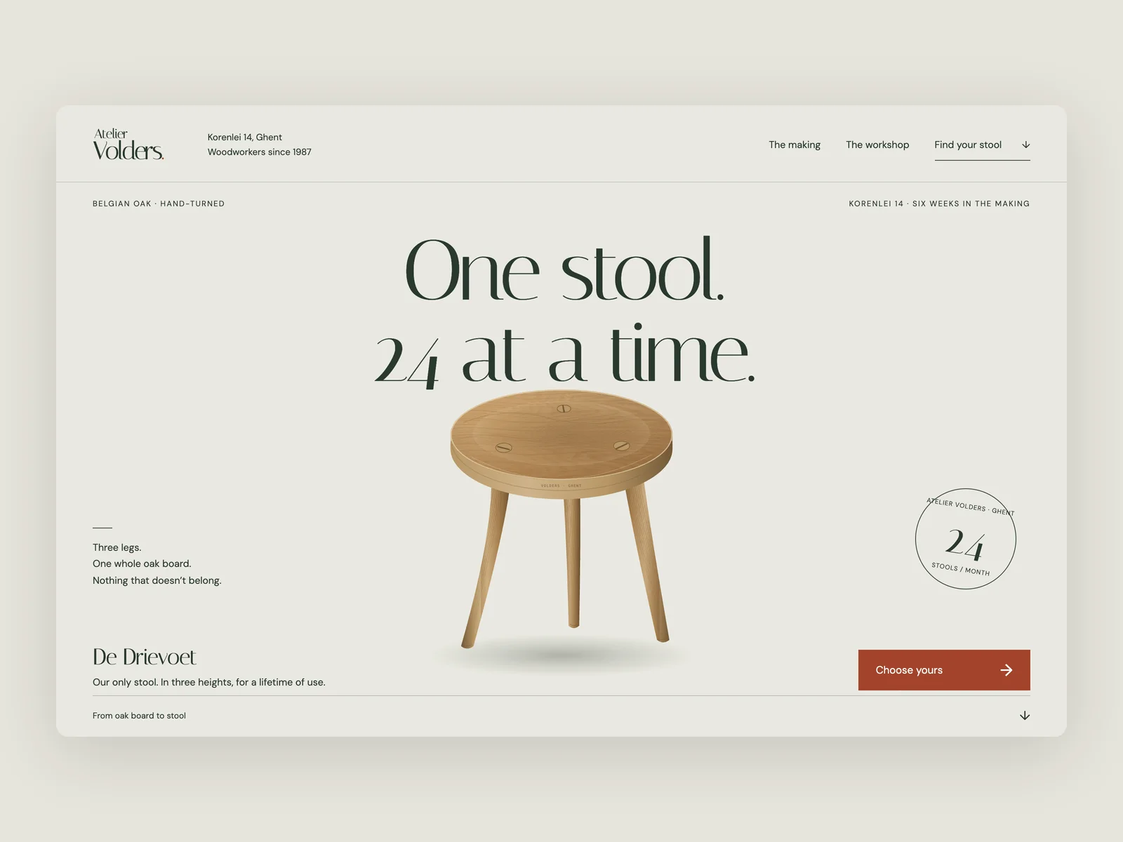
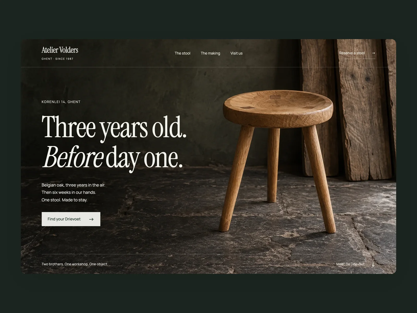
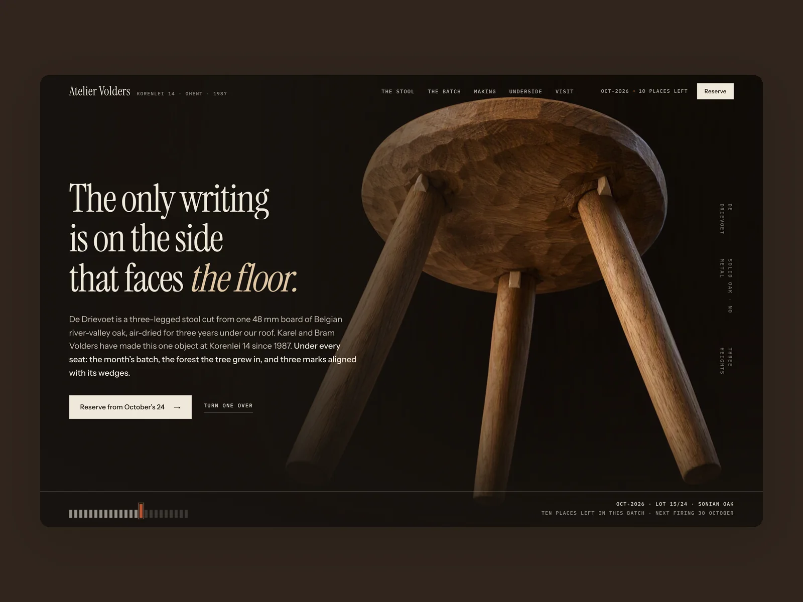
Atelier Volders · The Wedged Oak
Handcrafted furniture workshop website
DeepSeek 4.1 FlashOpen live demo ↗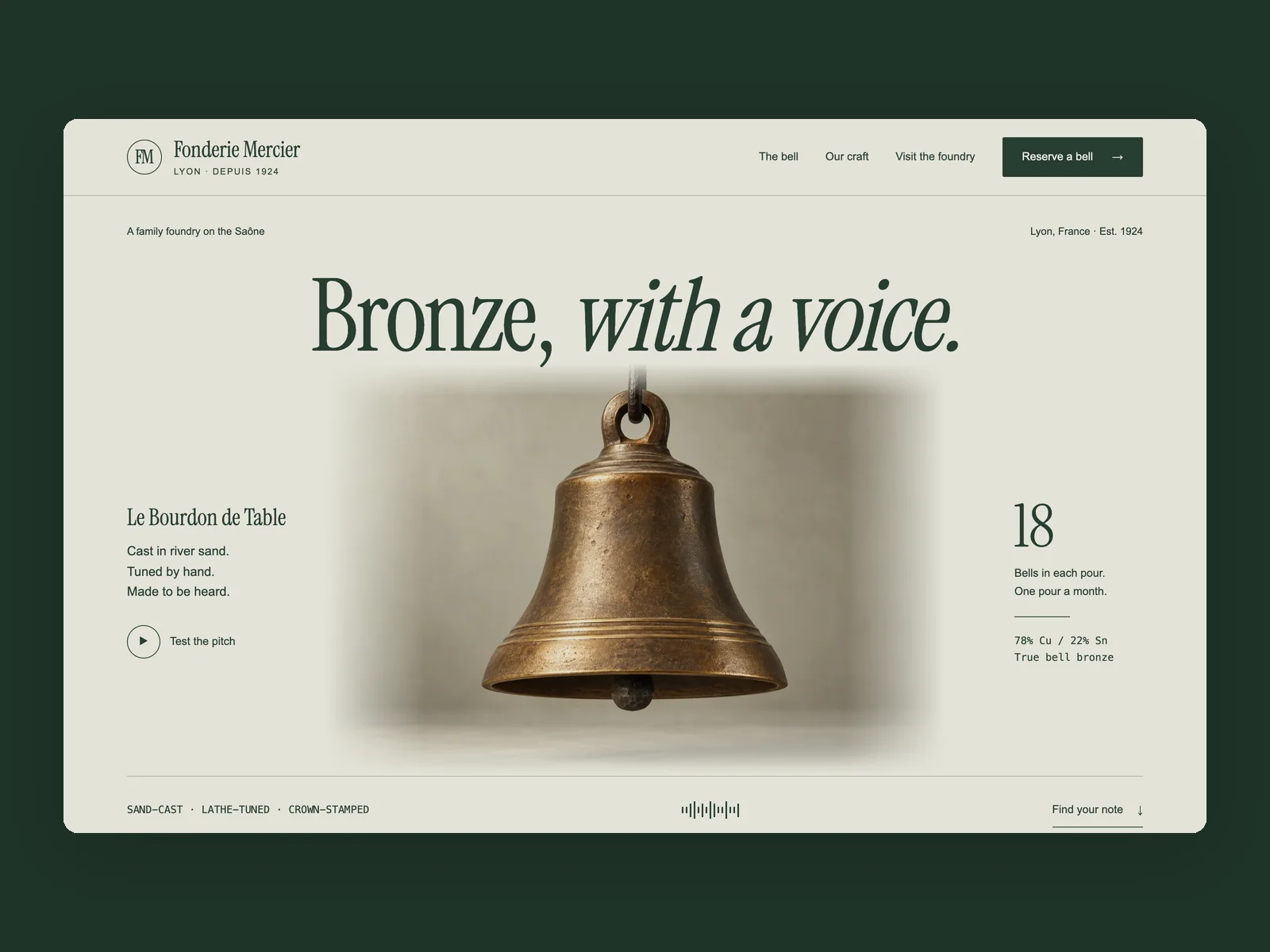
Fonderie Mercier · Bronze, with a Voice
Family bronze bell foundry website
GPT 6.1 SolOpen live demo ↗What Makes Three Directions Truly Distinct
Left unchecked, a model may hand you the exact same three-column grid painted blue, green and purple. Oil UI pushes directions apart across four structural axes (and Oil UI Pro adds an explicit direction-overlap check):
- Different first-screen composition and entry point
- Direction 1 might lead with assertive editorial type and an inline calculator; Direction 2 opens directly into an interactive workbench; Direction 3 uses an asymmetric split.
- Different typographic voice and scale ratio
- Pair a high-contrast editorial serif in one candidate against a crisp grotesque + monospace tabular system in another.
- Different surface brightness and density
- Test how your real content reads on warm paper, crisp daylight white or a focused dark surface appropriate to the category.
- Strict single-winner discipline after selection
- Treat the comparison board as a clean selection step. Once you pick Direction B, build all subsequent states inside Direction B’s rules without Frankensteining widgets from Direction A.
Prompt Template to Trigger a Side-by-Side Comparison Board
Use this prompt whenever you start a new website, app flow or flagship screen redesign:
Use Oil UI to explore design directions for [product name & category].
- Real product content: [Include your headline, 3 core capabilities, exact pricing or key domain fields]
- Target viewport: [1440×900 desktop / 390×844 mobile]
Before building the full production states, generate a side-by-side comparison board with 3 genuinely distinct visual directions. Pull them apart in hero composition, typographic pairing and surface tone while using our real product content. Once I pick a winner, we will refine the full flow.
Supported out of the box in both the free Oil UI skill and Oil UI Pro.
Working gallery examples & prompts
Browse collection →Oil UI Pro: Take your chosen direction all the way to 9/10 production craft
The free skill helps you pick the right direction on a comparison board. Once chosen, Oil UI Pro drives the screen to 9/10 quality with up to 3 rounds of blind review, 10 complex workspace templates, and repo-wide DESIGN.md extraction ($9.99 one-time, lifetime updates).
Explore Oil UI Pro →npx github:oil-oil/oil-cli install oil-ui-proCommon questions
Is the side-by-side HTML comparison board included in the free open-source skill?
Yes. The free Oil UI skill includes the side-by-side comparison board for both desktop and mobile viewports. Install it via npx skills add oil-oil/oil-ui and ask your agent to propose distinct design directions.
How many directions should I compare at once?
Three to four is the sweet spot. Two options often feel too binary, while more than four dilutes the craft spent on each candidate.
Can I combine the palette from Direction A with the layout of Direction B?
You can swap a cohesive color palette onto a winning layout skeleton, but avoid mixing individual card styles or typography scales from different directions. Ask the agent to apply Direction A’s surface palette cleanly onto Direction B’s layout and re-verify contrast.
Which gallery pieces best demonstrate multi-direction exploration?
Open the nine Orvo landing pages, the three Atelier Volders workshop sites, the three Fonderie Mercier bell foundry sites, or the paired Vesper, Sonar, Archon and Tempo pieces. They are useful for side-by-side comparison in browser tabs; where task briefs are available, you can also compare the recorded prompts.